
![[title]](http://farm2.static.flickr.com/1108/1089299535_fad2484112.jpg)
Got a cheap sketch book so I'm not intimidated or scared of placing a blemish in a fancy moleskine. So, now I'm drawing more. Hands are difficult.
I think this one turned out the best. It worked out nice that the final version appeared to be drawing my initial, aborted attempt. That was totally unintentional.
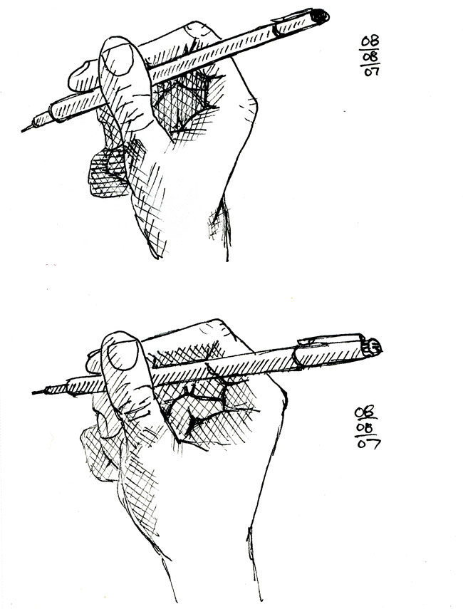
These ones weren't right. The bottom one was too fat and at the last second I messed up the wrist on the top one. I also wanted to try getting more contrast in terms of values with cross-hatching.
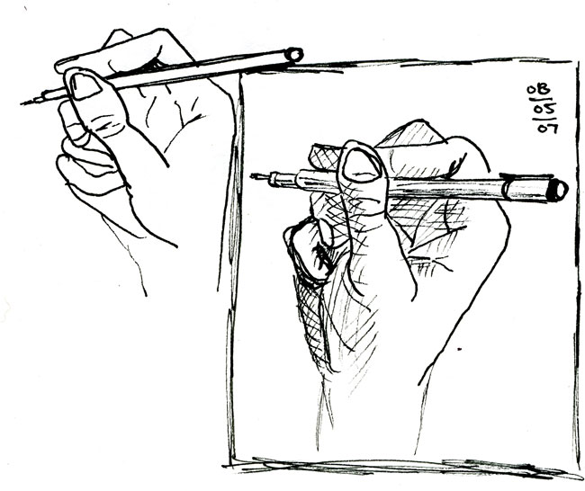
These two were looking pretty good. I just didn't like the how the fingers curled underneath turned out. That part didn't feel right. I framed the one I felt was better.


2 comments:
I love the top one. Your style is so confident that even the less perfect ones look really good here.
Gosh, Ryan, i just left you a super long comment and i lost it. HOORAY for the CHEAPO sketchbooks! I recently realized that my Moleskine had become a syndrome, no less. Thanks to the cheap page, i've allowed myself to fail miserably and it feels good.
I like the middle sketch a lot. Don't hesitate to have fun and overlap your sketches all over the place -- and try different sizes on one page too.
I'm looking forward to more! And you make me want to draw my hands again (and experience true frustration!). -France
Post a Comment